The VCA in eight artworks
Many of Australia’s most notable established and emerging artists have passed through the Victorian College of the Arts. Here, current staff reflect on the works that have most impacted them.
Howard Arkley’s House and Garden, Western Suburbs, Melbourne (1988)
By Jon Campbell, Lecturer in Painting
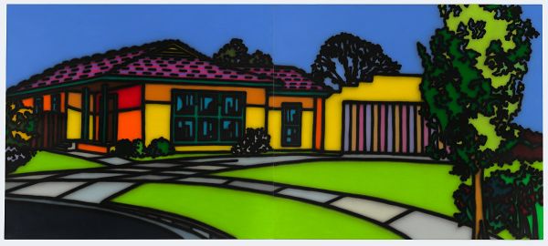
Image courtesy of Kalli Rolfe Contemporary Art.
I met Howard Arkley in 1984 when I was at the Victorian College of the Arts studying for my postgraduate diploma. He was a guest lecturer one day a week, and was very encouraging about my paintings and subject matter.
We were both from Melbourne’s suburbs and Arkley reinforced to me that the look and feel of suburbia could in fact be significant subject matter for contemporary artists.
We remained friends after my study finished.
Arkley had started his “house” paintings around this time, and I related to them straight away: the exteriors were very familiar to me, having grown up in Altona in Melbourne’s West, although they were a little more psychedelic due to Arkley’s use of airbrush, colour and pattern.
Arkley’s fine eye for detail is evident in House and Garden, Western Suburbs.
He pays particular interest to the mown lawn, concrete paving and the garage, which sits proudly next to the house.
The foreground patterning is where all the pictorial action happens – the perspective and curves of the paving make a dynamic pathway to the house.
The painting feels quite still, ordered, maybe even bland, with no figure in sight, although the immaculate manicured lawns imply that someone is taking good care of the place.
It reminds me of my teens, during which I was crazily obsessed with trimming the nature strip, to see how perfect I could get it. Did I want to have the most perfect nature strip in the street? Maybe I did.
Arkley’s paintings celebrate what it means to live in the burbs. While they excite and engage me through their pictorial dexterity, it’s the memories they conjure that I find most interesting.
Aya Hamamoto, Documentation of Repetition (2014)
By Stephen Haley, Senior Lecturer in Visual Art
VCA visual art students regularly produce work that is unexpected – delightfully so, mostly – but also ranging well into the realm of the alarming.
I’ve seen an entire car installed, somehow, in a small room on the third floor of a building; I’ve participated in group tutorials with paid, silent and totally naked models interspersed among the class; a student once made a boat from detritus in his studio and then, after lugging it across the road, serenely sailed it in the National Gallery of Victoria moat – until the police arrived.
Yet being truly impressed – having something, somehow, stamped indelibly on you, is very much rarer.
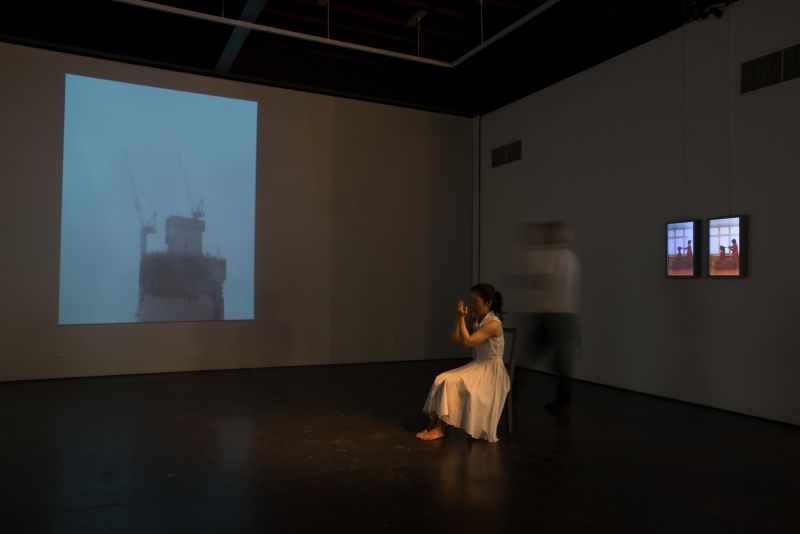
In 2014, for her end of year Master of Contemporary Art presentation, Japanese student and current Master of Fine Art candidate Aya Hamamoto presented an installation in the Margaret Lawrence Gallery, on the VCA’s Southbank campus.
In short, it was the most emotionally-affecting artwork I have seen in years, and possibly ever.
Through images and video, it commemorated the sudden and untimely death of Hamamoto’s sister.
These were haunting, melancholic visions: a city building shrouded in swirling, dense cloud; empty landscapes; film of her parents undertaking strange, repetitive interactions.
As if that wasn’t enough, Hamamoto herself occupied the centre of the gallery. Tiny and frail in a plain white dress, she sat there singing all day, every day, for hours on end.
In a remarkably large, powerful and reverberating voice, she intoned a bell-ringing dirge, bookended startlingly by redolent silence. More sounds than words, they were delivered into Hamamoto’s flattened palms, her hands suspended in front of her face.
The space resonated like vibrating crystal. The work was immersive, stately, beautiful, heart-wrenching and simply stunning – not a representation of tragic emotion but an embodiment of it.
Transcending the particularly of her sister’s death, it became a mourning, a keening, for human mortality, for being itself.
John Meade’s Fan, Flames and Light (1994)
By Dr Kate Daw, Senior Lecturer and Head of Painting
Every year, when my students leave the Victorian College of the Arts, my brain does something weird: it deletes most of their names, maybe to make way for the new, incoming artists.
To me, the coming and going of new artists can feel a bit like a tide washing in and out, leaving some lasting memories on the shore.
I’ve been involved with the VCA in one way or another, both as a student and now as Head of Painting, since I crossed the country as a young, half-formed thing to study there in 1987.
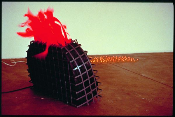
But over those years, if I had to pick one particularly stand-out piece, it would be a student work from the Sculpture Department that I saw way back in the 1994 Graduation Exhibition: John Meade’s Fan, Flames and Light.
Sometimes, work made by students adopts a sophistication that feels “tried-on”, as if the student is testing what may or may not be possible to present to the world. Rarely, and thrillingly, a student will present something startling and new that surprises both the audience – and often the students themselves – in its genuine freshness.
I don’t know if Meade was surprised (in fact, I suspect he wasn’t) but his work certainly had an impact on the audience at the exhibition opening that year.
The enduring memory I hold is one of flickering colour and movement. In the post-modern, nervous and overwhelmingly monochromatic Melbourne art world in the early 1990s, Meade’s installation was, strikingly, full of pink and orange fake flames and feathers.
Those elements span around and reflected brightness and shadow, buoyancy and weight. Carnivalesque and audacious, it drew in the viewer.
I now know Meade was referencing India, a country that we have since explored together, because, after the experience of viewing his work, we came to work together at the Next Wave Festival the following year.
We have enjoyed a good working relationship ever since.
Bea Maddock’s TERRA SPIRITUS ... with a darker shade of pale (1993-98)
By Clare Humphries, Lecturer in Drawing and Print Media
In 1987 Bea Maddock (1934–2016), celebrated artist and Acting Dean at the VCA from 1979 to 1980, watched the Tasmanian coastline come into view from the bow of a ship.
She had spent 40 days at sea to visit Earth’s southernmost continent on the Artists in Antarctica program.
Unfortunately, while alighting at Heard Island, 1,000 kilometers north of her intended destination, Maddock sustained a leg fracture.
Unable to continue to the mainland, she spent her days drawing the Antarctic coastline from her cabin porthole, an occupation that culminated in the suite of pale etchings called Forty pages from Antarctica (1988).
I think of Maddock during those days on the ship, sitting in her cabin looking out over an uninhabited, ice-covered landmass – trapped inside and peering out toward a distant, foreign territory.
But, as Tasmania came into view, it seems to me that an inversion occurred, where inside became out.
Maddock was granted a new perspective on the island of her birth from a place beyond its shores.
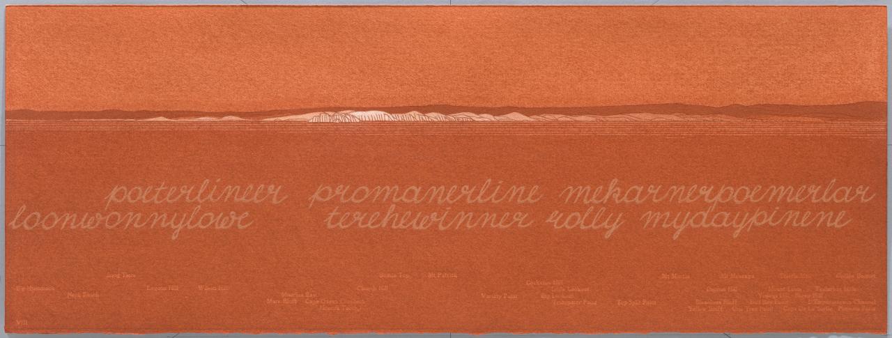
The encounter with her Tasmania from the Antarctic vessel was clearly significant, prompting her to embark on her most significant work: TERRA SPIRITUS … with a darker shade of pale (1993–98).
It took five years to complete and, in breathtaking fashion, expanded on her research in Forty pages.
TERRA SPIRITUS comprises 51 sheets of paper (plus title page) that chart the entire coastline of Tasmania as if viewed from the sea.
The first starts at South West Cape where records suggest Tasmanian Aboriginals sighted European ships for the first time. From there, sheet after sheet describes the bays, lagoons, mountain ranges and bluffs as they would be viewed at a short distance from the coast, each inscribed with Indigenous and European place names that evoke thoughts of traditional ownership and European colonisation.
Describing the work, Maddock said: “Each drawing was made as if looking into the centre of the island and there is no concept of north or south, east or west; there is only the compulsion of looking inwards.”
In method, TERRA SPIRITUS transgresses the conventional, territorial boundaries between printmaking and drawing. Every cliff, valley and inlet is recorded in the red ochre that was collected and ground by the artist herself into ten distinct tones.
She used stencils to score lines into the paper – a strategy that enabled her to edition the panoramas – then worked ochre into the lines, much like ink being rubbed into an etching plate.
Other lines Maddock left free of pigment, more like a relief block, to describe the highlights on the sea. On completion, the work was neither print nor drawing and demanded a new terminology to aptly describe it as a “drawing-print” and an “inscribed drawing”.
TERRA SPIRITUS was most recently displayed in 2014 at the Queensland Art Gallery & Gallery of Modern Art – where it was hung without any visible means of support, just as Maddock herself wished it.
Azlan Mclennan’s You need me (2003)
By Dr Kiron Robinson, Lecturer in Photography
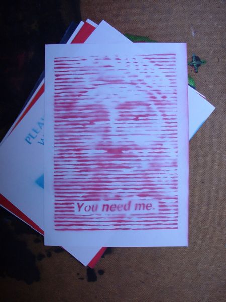
You need me (2003), by Azlan Mclennan. Images courtesy of the artist.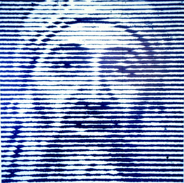
You need me (2003), by Azlan Mclennan. Images courtesy of the artist.
In 2001, as we all know, the World Trade Centre was attacked, triggering a series of actions and reactions of which we are still feeling the effects.
The image is power. Osama bin Laden understood this in plotting the World Trade Centre attack. The literal bringing down of the symbolic heart of the capitalist empire was a far more potent action then any attack on a government or state institution.
The imagery resonated beyond the national or city boundaries of geography.
I remember being woken up in the middle of the night and told to turn on the TV, then watching the images again and again and again.
The next day, at art school, the shock was so palpable that being in a lecture theatre felt like unreal compared to the realness of the images we had all shared and seen.
Azlan Mclennan’s 2003 work You need me, was made two years after the attacks.
It’s one of the most remarkable works to reflect on the “war of images” that began playing out during and after the September 11 attacks. It’s also one of the earliest (of this conflict) to offer an articulate reflection of the move from the image being of the icon to the image being the icon.
You need me, a drawing of a visualisation of an image, pinpoints the shift that was coming through social media, image-sharing and the wars waged through those platforms.
Think YouTube, Instagram, Twitter and the likes, and the use of those platforms by organisations on all sides to wage war beyond the borders of any actual conflict.
In other words, You need me understood that the image of Osama Bin Laden was more important than the reality of him. It’s a piercing work that simultaneously reflected its present and foretold its future.
Makiko Yamamoto’s Martin and Me (2012)
By Sanja Pahoki, Lecturer in Photography
martin and me 3 min (2012) from makiko yamamoto
My father loved watching spaghetti westerns – which meant the whole family watched them.
I didn't know they were called spaghetti westerns until I was older, or that “spaghetti” referred to the fact they were made in Italy.
Likewise, I didn’t know the films had been dubbed into English because the dubbing was very good: the mouth movements seemed to perfectly match the words being spoken. But then again, who was I to judge?
I was just a kid for whom English was a second language.
The television shows that I liked to watch, and knew were dubbed, were Lancelot Link: Secret Chimp and Thunderbirds. In those shows, the mouths had a limited up and down movement, and, clearly, the words didn't match the formation of the lips.
That didn't matter because it was thrilling to see real chimpanzees and puppets talking and behaving like people.
The quality of the dub is one of the reasons I love Makiko Yamamoto’s Martin and Me video so much. The original video is from an interview the British artist Martin Creed gave around the time of his bell-ringing commission for the 2012 London Olympics.
In Martin and Me Yamamoto dubs Creed’s speech with unintelligible utterances. As far as dubs go, it’s pretty bad. It is knid of the opoptsie of tihs dscirevoy werhe ltteer oderr dseont mttaer. You can sitll uderntsnad teh manennig, bcuseae the huamn mnid deos not raed ervey lteter by istlef, but the wrod as a wlohe.
Yamamoto breaks down verbal communication by focusing on the phonology of language. The parts. The attention shifts from what is being said to how it is being communicated. Martin Creed’s hair and the laugh.
Natasha Johns-Messenger’s Yellow (2003)
By Dr Mark Shorter, Lecturer in Sculpture and Spatial Practice
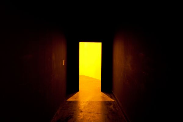
Exhibited at the VCA in 2003, Yellow, by Natasha Johns-Messenger, recasts how we see and experience art, and in particular formalist public sculpture.
The installation was composed of a fabricated passageway with four mirrors strategically placed for periscopic effect, winding the viewer in a continual reversal as they walked through the space.
At the end of the passageway the viewer encountered a yellow lit wall with a “peephole'”view of Ron Robertson-Swann’s Vault – often referred to as the “Yellow Peril”: a monumental steel sculpture in Melbourne’s Southbank, a stone’s-throw from VCA Art.
For me, Yellow is compelling for the way it co-opts Robertson-Swann’s sculpture into its own narrative – one that questions the reliability of human perception.
It’s beautifully ironic, because formalist sculpture is constructed to be observed from a relatively stable and secure logic; it asks the viewer to acknowledge its autonomy as an art object. Its poetics don’t lie within a relational space where spectators might draw connections between the aesthetics of the work and personal experience.
Rather, those poetics lie within, and with respect to, the structure itself; in the way the large steel shapes seem to defy gravity by dancing and pivoting through the space.
In Yellow, Johns-Messenger turns that logic on its head. Through the glowing yellow peephole, the sculpture is no longer an autonomous object but rather an object sited within a landscape and connected to a larger tapestry of events both natural and constructed.
By reframing the sculpture thus she suggests that we might read it beyond its internal logic and within an embodied experience that takes into account the reckless and unpredictable nature of being.
Ricky Swallow’s Building Better Beings (2000)
By Professor Jon Cattapan, Deputy Director of the VCA
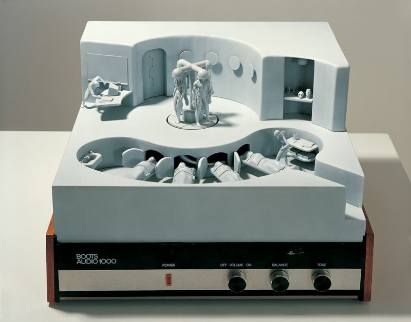
Ricky Swallow’s Building Better Beings is a finely-honed diorama assembled over a vinyl turntable case; it’s a work in which all of his early ambitions and concepts are revealed. A retro nostalgia (the work is resolutely “analogue”) is evident, and there is a nod to science fiction (Swallow, I know, was a huge Planet of the Apes and Star Wars fan).
Swallow began his time at the VCA in 1994 in Drawing, a gifted 19-year-old student from the regional fishing village of San Remo, Victoria, via the Box Hill TAFE program. I remember our first conversations as being surprisingly well-directed by him, and wide-ranging in terms of influence.
It is not for me to make definitive pronouncements about other artists, but I think it’s fair to say that in his first ten years after art school, Swallow’s vision, ambition and the sense that he was in effect “creating a genre” through his fastidious model-making, was hugely influential on his peers. He became known quickly, winning in 1999, at age 25, Australia’s richest contemporary award at the time: The Contempora Prize.
By 2005 he had represented Australia at the Venice Biennale with a sublimely-crafted set of major carved works.
I feel I “know” the tiny sculptural elements presented in Building Better Beings. Being intimate in scale, the work demands of us a close inspection of Swallow’s patiently-crafted parts, drawing us into a fantastical view of a hybrid human laboratory.
There is a strange prescient quality about this creepy little sci-fi scene. Are we not now, in our conflict-ridden present, moving ever closer to “enhanced” soldiering? At the centre of the work, assembled right where we would find the platter spindle on a turntable, there are four erect but lifeless humanoids harnessed to, or perhaps being extruded from, a yoke-like structure.
They appear at once ready and crucified – better but cruelled beings. It is a wondrous little world, brilliantly and intensely executed. Best of all, it’s delivered on a humble scale, as if to undercut the deadly serious grand-scale installation art that abounded in the art world at the time this work was made.